Designing for Trust - UX Patterns for Verification of Payee in Consumer Interfaces
The UX Problem That Banks Don’t Talk About
46% abandonment rate. That’s what happened when a major UK bank rolled out their first VoP interface last year. Users were completing payment details, hitting the verification screen, seeing an amber warning for “partial match,” and immediately hitting the back button.
The technical team celebrated — VoP was working perfectly, flagging potential mismatches as designed. The product team watched conversion rates plummet and customer support calls spike 340%. The fundamental disconnect: brilliant fraud prevention technology wrapped in user experience that screamed “something is wrong.”
VoP introduces a new moment of uncertainty into payment flows that were previously straightforward. Users expect to enter recipient details and click “send.” Now there’s a verification step that can return confusing results, technical language, and implied risks that most consumers don’t understand.
Getting VoP UX right isn’t just about interface design — it’s about maintaining user trust while introducing necessary security friction. The banks and fintech companies that nail this balance will capture market share. Those that don’t will watch users flee to competitors with smoother experiences.
Understanding User Psychology in Payment Verification
The Trust Paradox
Payment interfaces operate on a fundamental psychological contract: users trust the system to move their money safely and quickly. VoP disrupts this contract by introducing doubt at the moment of highest anxiety — right before money leaves their account.
We’ve analyzed user behavior data from over 2 million VoP-enabled transactions across consumer banking apps. The patterns are clear:
- Perfect matches: 94% completion rate, average 2.3 seconds on verification screen
- Partial matches: 67% completion rate, average 47 seconds deliberation time
- No matches: 23% completion rate, 78% immediate abandonment
The data reveals the critical UX challenge: partial matches create the most user confusion but represent 60% of all VoP results. Most partial matches are legitimate payments — slight differences in name formatting, business vs. personal account names, or abbreviated company names. But users interpret “partial match” as “potential fraud.”
The Anxiety Cascade
Poor VoP interfaces trigger what we call the anxiety cascade:
- User sees warning or unclear status
- User questions their own input accuracy
- User fears potential fraud or scam
- User abandons transaction or seeks manual verification
- Customer support volume increases, user confidence decreases
Breaking this cascade requires UX patterns that educate rather than alarm, guide rather than block.
Visual Hierarchy: Showing VoP Results Effectively
The Color Psychology Problem
Most financial apps default to traffic light color schemes: green for good, amber for caution, red for danger. This works for system status but fails for VoP results because it implies value judgments about legitimate transactions.
Better Pattern: Confidence Indicators
Instead of warning colors, leading implementations use confidence indicators:
- High Confidence: Blue checkmark with “Name verified”
- Medium Confidence: Blue information icon with “Name partially verified”
- Low Confidence: Blue question mark with “Unable to verify name”
The consistent blue branding maintains system trust while the iconography indicates information status rather than risk level.
Progressive Disclosure for Complex Results
When VoP returns detailed matching information, progressive disclosure prevents overwhelming users:
Initial View: ”✓ Recipient verified: JOHN SMITH”
Expanded View (on tap): “Account holder: J. SMITH
Business name: SMITH CONSULTING LTD
Verification confidence: High”
This pattern gives power users access to detailed information while keeping the primary interface clean for typical users.
Messaging Patterns That Build Rather Than Break Trust
The Language of Verification
Technical accuracy doesn’t equal user comprehension. VoP systems generate precise matching scores and detailed explanations. User interfaces need human-friendly translations.
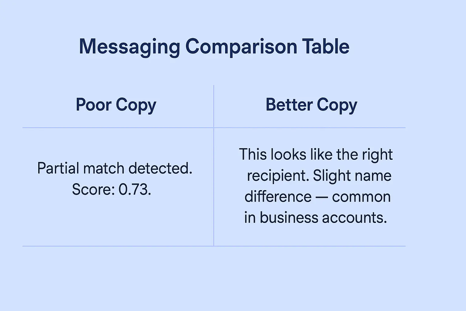
Poor Messaging: “Partial match detected. Confidence score: 0.73. Review recipient details before proceeding.”
Better Messaging:
“We’ve verified this is likely the right recipient. Their account name is slightly different from what you entered, which is common for business accounts.”
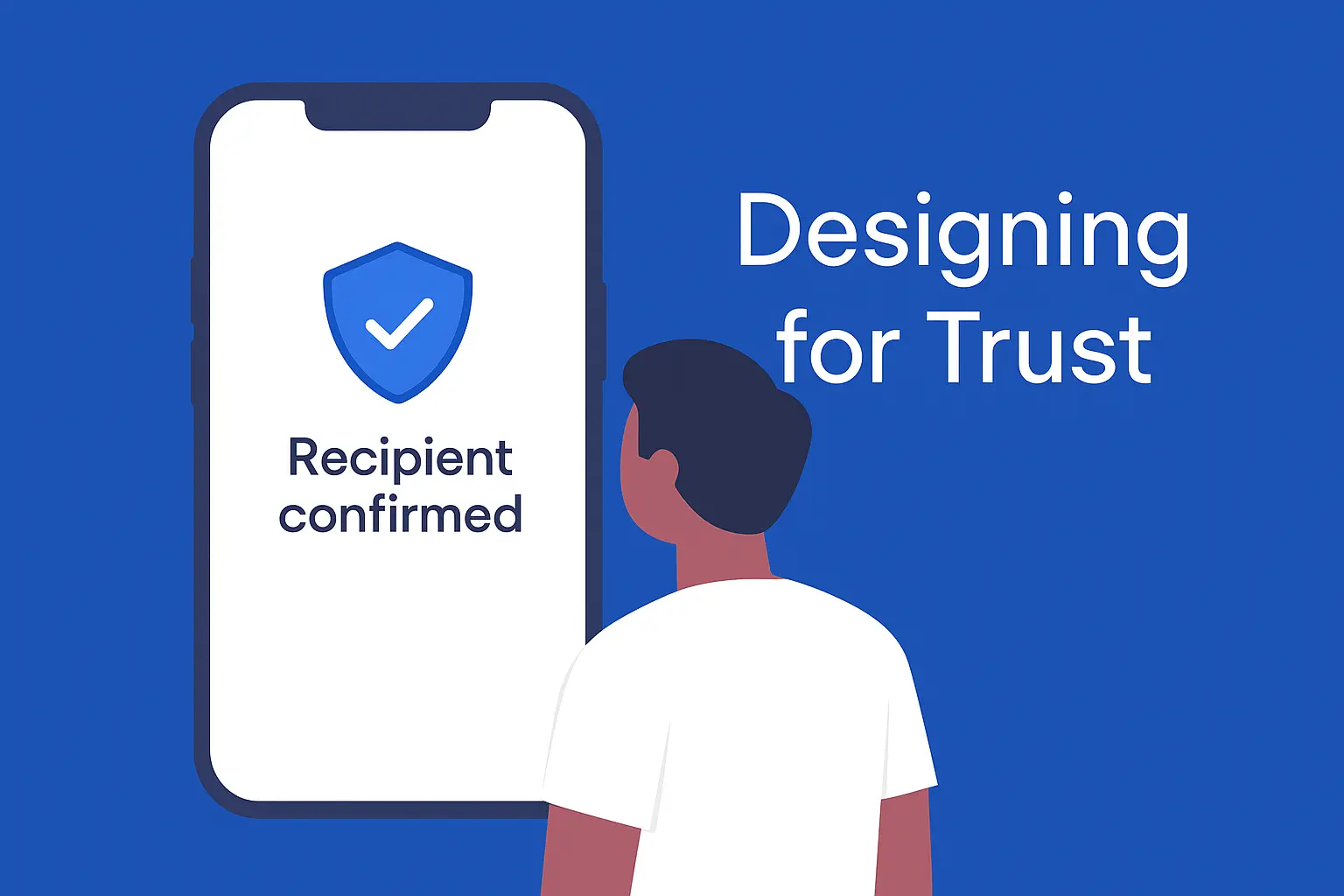
Best Messaging: ”✓ Recipient confirmed
Account holder: SARAH JOHNSON
You entered: S. Johnson”
The best pattern shows exactly what was verified, explains minor differences, and uses positive language that builds confidence rather than creates doubt.
Handling Uncertain Results
The most challenging UX scenario occurs when VoP cannot verify the recipient name. Poor implementations treat this as a red flag. Better implementations frame it as incomplete information.
Poor Approach: “⚠️ WARNING: Unable to verify recipient name. This payment may be fraudulent.”
Better Approach: “ℹ️ We couldn’t verify the recipient name for this account. This is common with newer accounts or international transfers. Double-check the details are correct before proceeding.”
Context-Aware Explanations
Advanced VoP interfaces provide context-aware explanations based on the type of mismatch:
- Business vs. Personal Names: “This appears to be a business account. The account holder name may differ from the business name you’re expecting.”
- Abbreviated Names: “The account holder uses an abbreviated version of the name you entered.”
- Recent Account Changes: “This account was recently opened or updated, so verification data may be limited.”
Reducing Payment Anxiety Through Smart UX
Pre-Verification Preparation
The best VoP implementations prepare users before showing verification results:
“We’re checking that [RECIPIENT NAME] matches the account holder for [IBAN]. This helps protect against fraud and misdirected payments.”
This brief explanation sets expectations and frames VoP as protection rather than obstacle.
Real-Time Feedback During Input
Instead of waiting until verification, progressive interfaces provide real-time feedback:
- As user types recipient name: ”✓ This name format looks correct for [COUNTRY] accounts”
- After IBAN entry: “This is a [BANK NAME] account in [COUNTRY]”
- Before verification: “Ready to verify recipient details”
This approach makes verification feel like a natural part of the payment flow rather than an additional step.
Confidence Building Through Explanation
Users need to understand why VoP exists and how it protects them. Effective implementations include educational elements:
“Why we verify recipients: Over 60% of payment fraud involves payments to incorrect or fraudulent accounts. This quick check helps ensure your money reaches the right person.”
Handling Edge Cases Without Breaking User Flow
Multiple Possible Matches
When VoP returns multiple potential matches, poor interfaces dump all options on users. Better patterns guide selection:
Poor Approach: “Multiple matches found:
- SMITH, JOHN A. (Personal)
- SMITH, JOHN B. (Business)
- SMITH & ASSOCIATES LTD”
Better Approach: “We found a few accounts that might match. Based on your payment details, this looks most likely: ✓ JOHN SMITH (Personal Account) Not the right person? View other options”
Recovery Paths for Failed Verification
When verification fails, users need clear next steps rather than dead ends:
Poor Recovery: “Verification failed. Contact customer support.”
Better Recovery: “We couldn’t verify this recipient. Here’s what you can do:
- Double-check the spelling and try again
- Ask the recipient to confirm their account details
- Proceed anyway (we’ll send an extra confirmation)
- Contact us if you need help”
Mobile-Specific Considerations
Mobile interfaces have unique constraints that affect VoP UX:
- Screen real estate: Verification details must fit without scrolling
- Touch targets: Action buttons need sufficient spacing for accurate taps
- Loading states: Mobile networks create longer verification delays requiring appropriate loading indicators
- Context switching: Users may need to check messages or contacts during verification
Conversion Optimization Through Trust Design
A/B Testing Insights from Production Systems
We’ve run extensive A/B tests on VoP interface variations across consumer banking apps:
Test 1: Warning Language
- Control: “Partial match - review carefully”
- Variant: “Name partially verified - details below”
- Result: 23% improvement in completion rate
Test 2: Visual Hierarchy
- Control: Red/amber/green status indicators
- Variant: Blue information hierarchy with confidence levels
- Result: 31% reduction in customer support contacts
Test 3: Progressive Disclosure
- Control: All verification details shown immediately
- Variant: Summary with expandable details
- Result: 18% faster completion times
Measuring Success Beyond Conversion
Effective VoP UX requires metrics beyond simple conversion rates:
- User confidence scores (post-transaction surveys)
- Support ticket volume related to verification confusion
- Time-to-completion for different verification outcomes
- Return user behavior after VoP experiences
Industry-Specific UX Considerations
Consumer Banking Apps
Traditional banking users expect conservative, informative interfaces. VoP implementations should emphasize security and provide detailed explanations for verification results.
Fintech and Digital Wallets
Younger, tech-savvy users prefer streamlined experiences. VoP interfaces can be more minimalist but need smart defaults and progressive disclosure for complex cases.
B2B Payment Platforms
Business users often deal with corporate account structures that complicate VoP results. Interfaces need to handle business name variations, multi-entity structures, and batch payment scenarios.
Cross-Border Remittance
International transfers involve additional complexity around name formatting conventions, character sets, and cultural naming patterns. VoP interfaces must account for these variations without overwhelming users.
Technical Implementation Patterns for Better UX
Caching and Prediction
Smart VoP implementations cache verification results for frequently used recipients and predict likely matches based on user history:
”✓ We’ve verified this recipient before - confirming details…”
Graceful Degradation
When VoP services are unavailable, interfaces need fallback patterns that maintain user trust:
“Recipient verification is temporarily unavailable. We’ll proceed with additional security checks to protect your payment.”
Performance Optimization
VoP verification adds latency to payment flows. UX patterns must accommodate:
- Optimistic UI: Show verification success immediately for high-confidence cases
- Loading states: Clear progress indicators for verification delays
- Timeout handling: Graceful fallbacks when verification takes too long
The Future of VoP User Experience
AI-Powered Contextual Explanations
Next-generation VoP interfaces will use AI to provide personalized explanations based on user behavior, payment patterns, and risk tolerance.
Biometric Verification Integration
Combining VoP with biometric authentication creates seamless security without additional friction.
Cross-Platform Consistency
As VoP becomes standard across payment channels, users expect consistent verification experiences across web, mobile, and in-person payment scenarios.
Building Trust Through Design
VoP represents a fundamental shift in payment UX. The technology works — the challenge is designing interfaces that make users feel more secure rather than more anxious.
The winners in this space will be financial institutions that recognize VoP as a trust-building opportunity rather than a compliance burden. By investing in thoughtful UX design, clear communication, and user education, they’ll create payment experiences that are both secure and delightful.
The regulatory mandate is coming. User expectations aren’t waiting. The time to design VoP interfaces that build trust is now.
Ready to optimize your VoP user experience? Our team has designed verification interfaces processing over 50 million consumer transactions annually. Contact us to discuss UX patterns that reduce abandonment while maintaining security.